
ezcred
Payment tracker for BNPL (Buy Now Pay Later) Users
Duration
1 month
Client
AFF - Fintech
(Freelance)
My Role
UX/UI Design
Scope
Desk Research
UX/UI Design
Tools
Figma

Overview
Problem
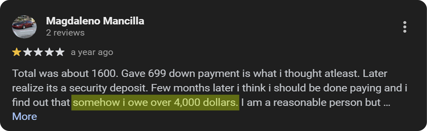
A BNPL company, ezcred (Credit management system org) has accumulated over 1000
1-star reviews on Google, signaling severe customer dissatisfaction. Users struggle with payment management due to inconsistent communication, unclear schedules, and unexpected fees. This has resulted in a significant loss of trust and a high churn rate as customers discontinue their services.


Outcome
I ideated a payment tracker dashboard that enables users to effortlessly monitor BNPL commitments, offering transparent product details and timely reminders to ensure on-time payments and rebuild trust.
User Research
Desk
Research
User Painpoints from Google reviews and online forums
I analyzed Google reviews and online forums like Reddit to understand user behaviors and habits when using BNPL services. Here are the key pain points users face:
Missed Payments Due to Unclear Schedules
Users often find it hard to track the financing options which can shift from monthly to
bi-weekly or offering 0 interest with terms, leading to missed payments and higher fees.
Hidden Fees and Unclear Communication
I was surprised to discover the sheer volume of complaints about hidden fees and how difficult it is for users to figure out the true cost and why they are paying more.
Distrust Leading to High Churn
Once users encounter hidden charges or unclear balances and dropping credit scores , their trust in the service erodes quickly, prompting them to abandon the platform.
!?
How might we design a way to help users provide simplified payment schedules with transparent and timely payment information to stay on track with their financial obligations?
Ideation
User Stories
As a first-time BNPL user, I want to easily view my payment schedule, so I can understand my financial obligations clearly
As a frequent BNPL user, I want to see all my active BNPL agreements in one place,
so I can manage multiple commitments efficiently.As a user making a high-value purchase, I want to see a detailed breakdown of my long-term payment plan, so I can understand the total cost over time.
As a user building credit, I want to see how my payment history affects my creditworthiness, so I can understand the benefits of on-time payments.
Brainstorm and Prioritize Solutions
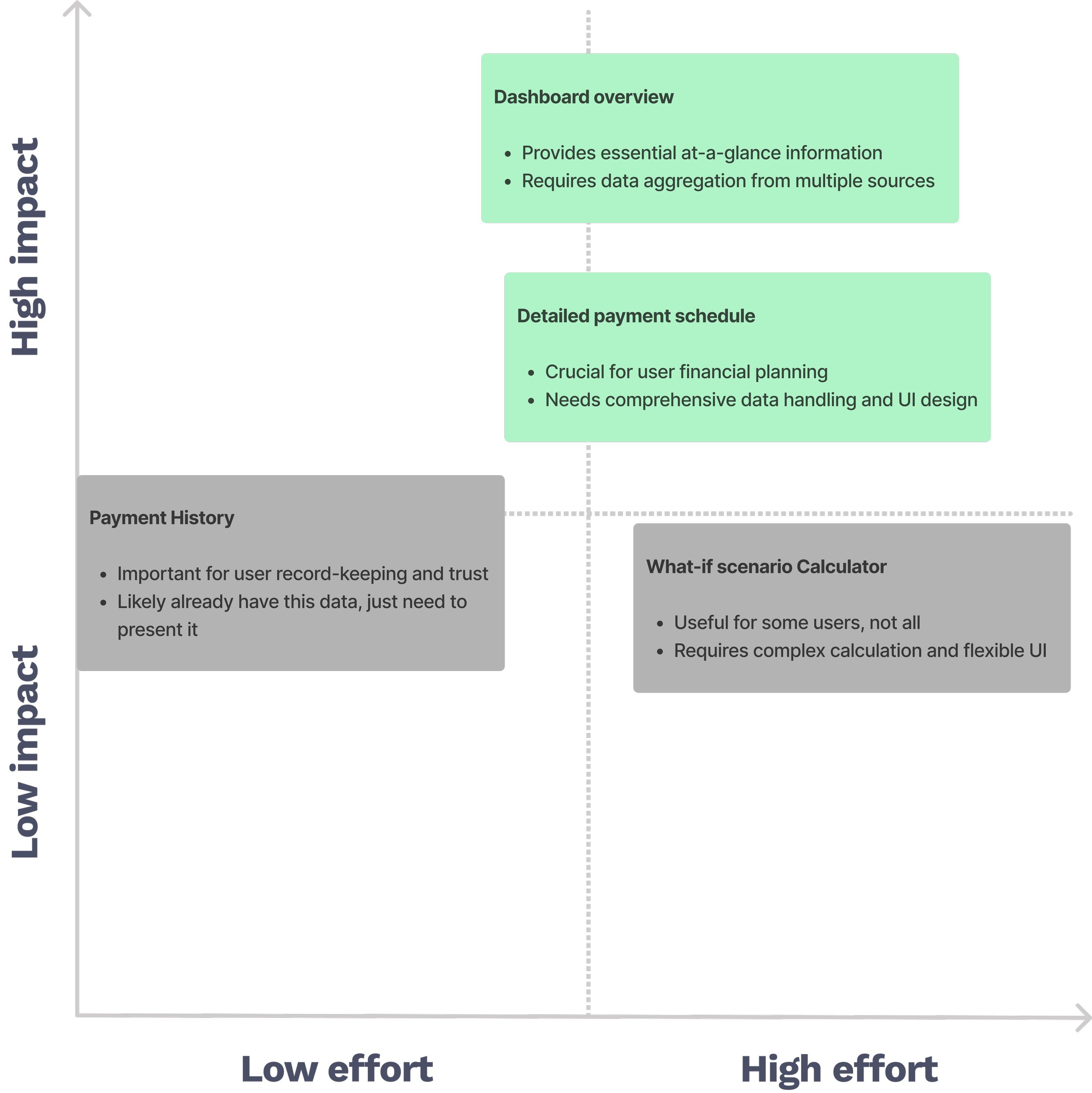
I wasn't sure which approach would best solve our users' payment tracking struggles, so I turned to my users again. Their feedback suggested inefficient tracking and information updating in existing dashboards. I chose to design a comprehensive dashboard as it provides flexibility to evolve with user feedback and incorporate new functionalities.
User Emotional States
Anxious about upcoming payments
Curious about remaining balance
Stressed about financial obligations
Satisfied after making a payment
Confused about payment terms or schedules
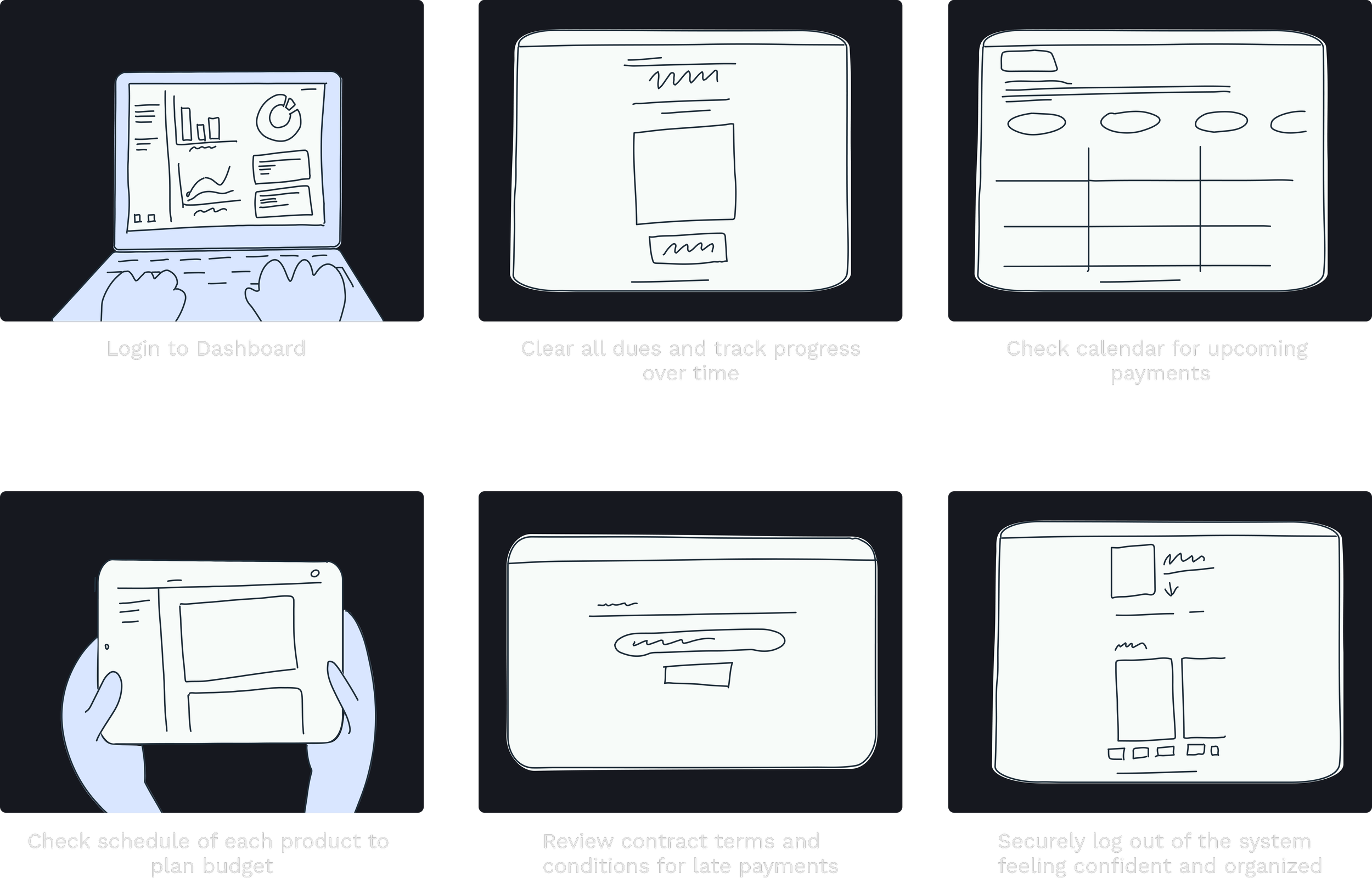
User Flow
Design
Design Goals
Concluding from the research insights and synthesis, the solution needs to...
Enable users to clearly track, understand, and manage their BNPL payments with minimal stress or confusion.
Build trust through transparent, accessible information and reward users for consistent, timely engagement.
I aimed to create an MVP focused on clarity and transparency, with plans for iterative improvements based on user feedback.
Design
Decisions
Tackling Missed Payments
I added color-coded reminders and visual cues to make due dates hard to miss and ease that payment anxiety.
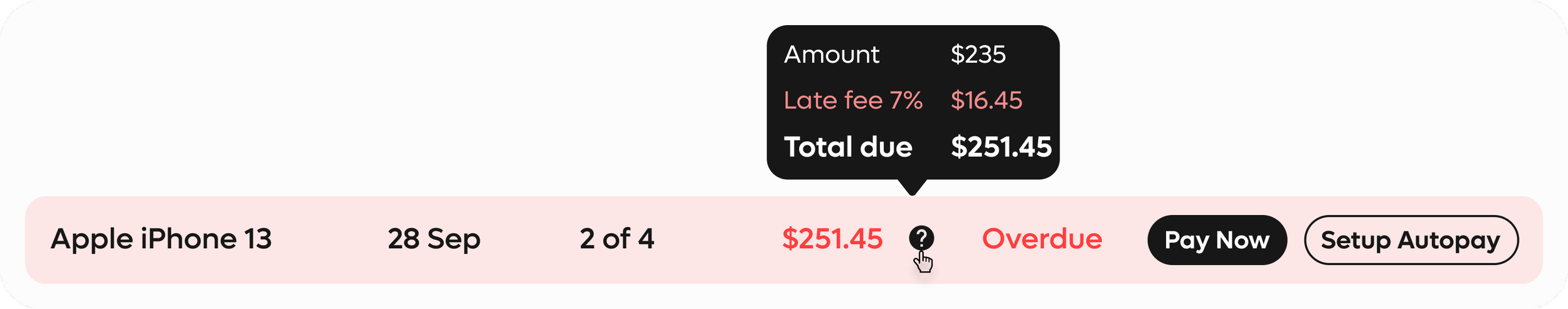
Hidden Fees Transparency
I presented clear product wise payment breakdowns and added contextual info panels to remove hidden charges and build user trust.


Remaining Payment Visibility
I displayed both total and monthly balances upfront to give users better control and clarity over their financial commitments.


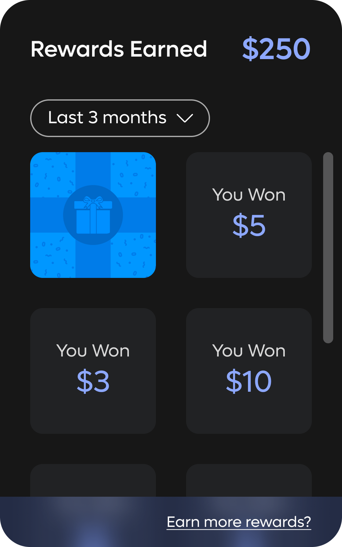
Boosting User Retention
I introduced a reward system that recognizes on-time payments, encouraging consistent use and strengthening user engagement.
Final
Solutions
Along with payment tracker and rewards I also added a credit score tracker based on user feedback and to promote a sense of achievement/caution.
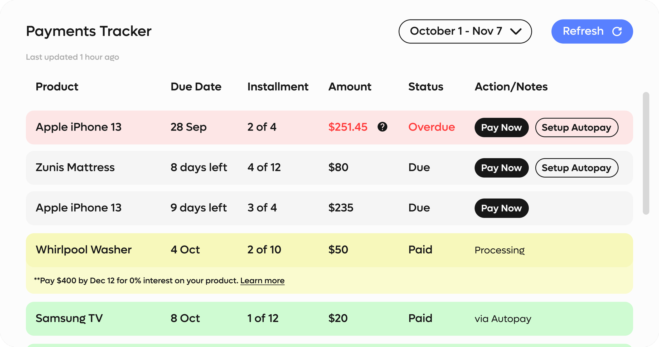
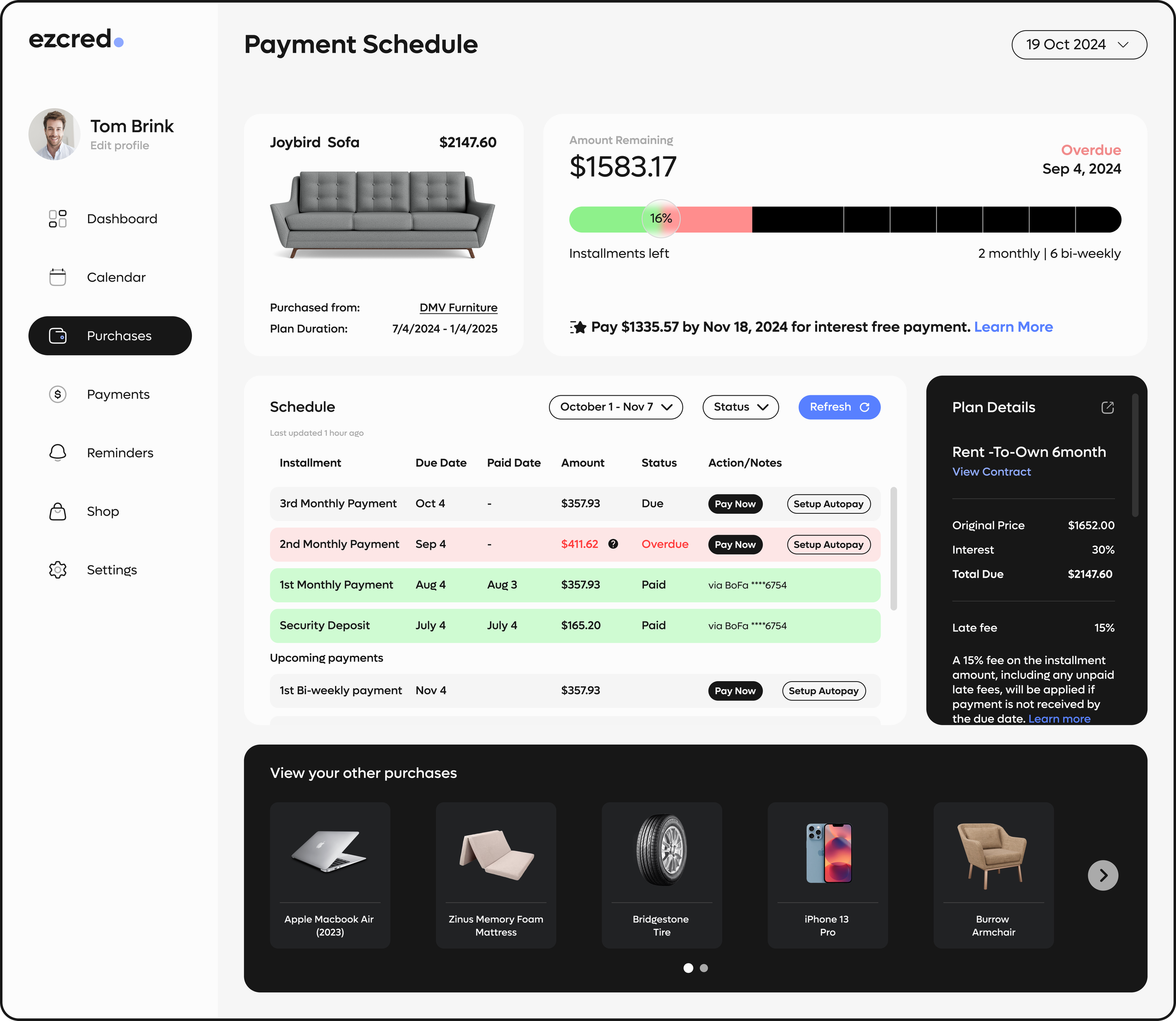
Dashboard
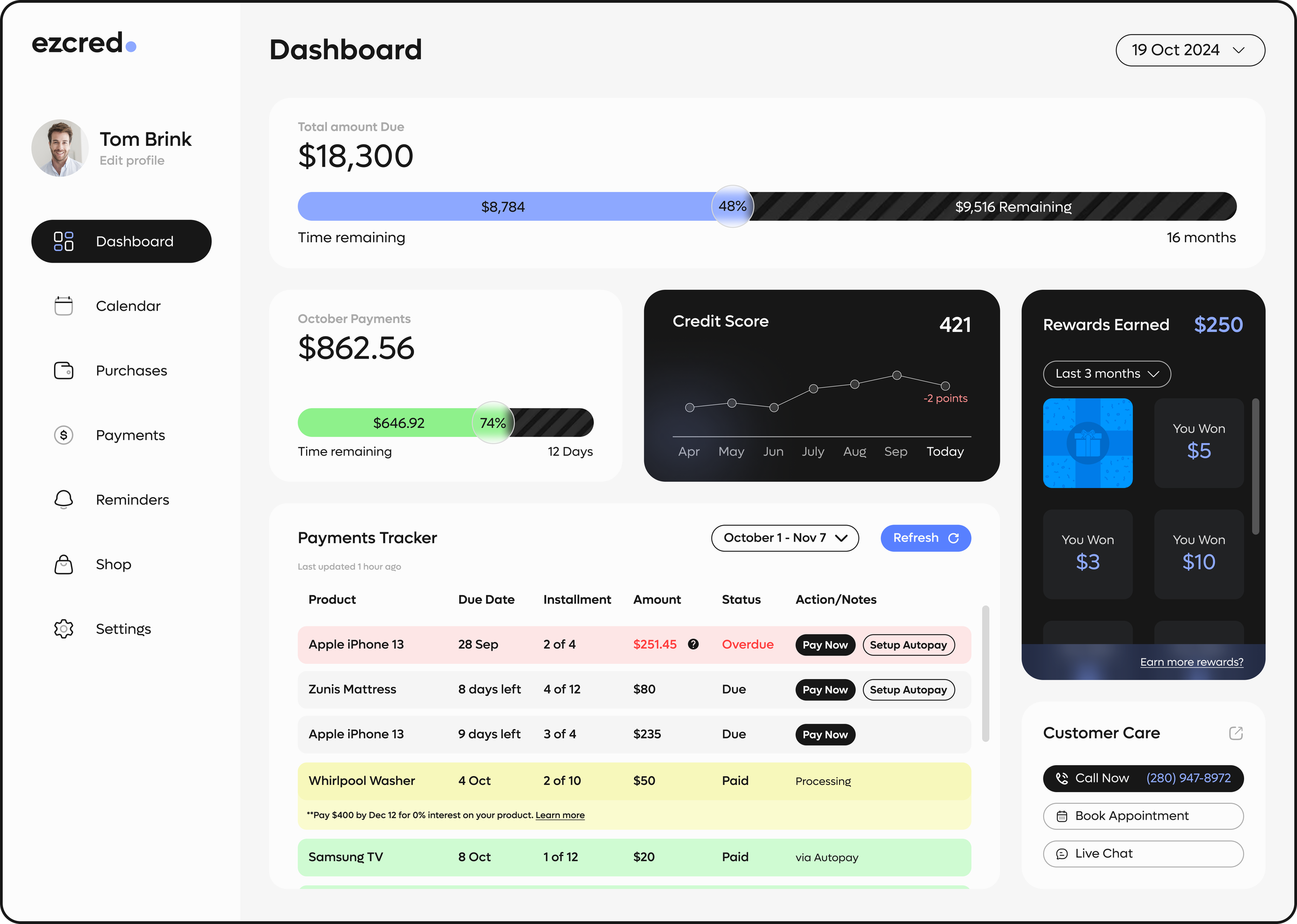
Calendar
Clutter less calendar view visually highlighting due dates with payment status. Monthly progress displaying remaining payments while alerting users on overdue amounts

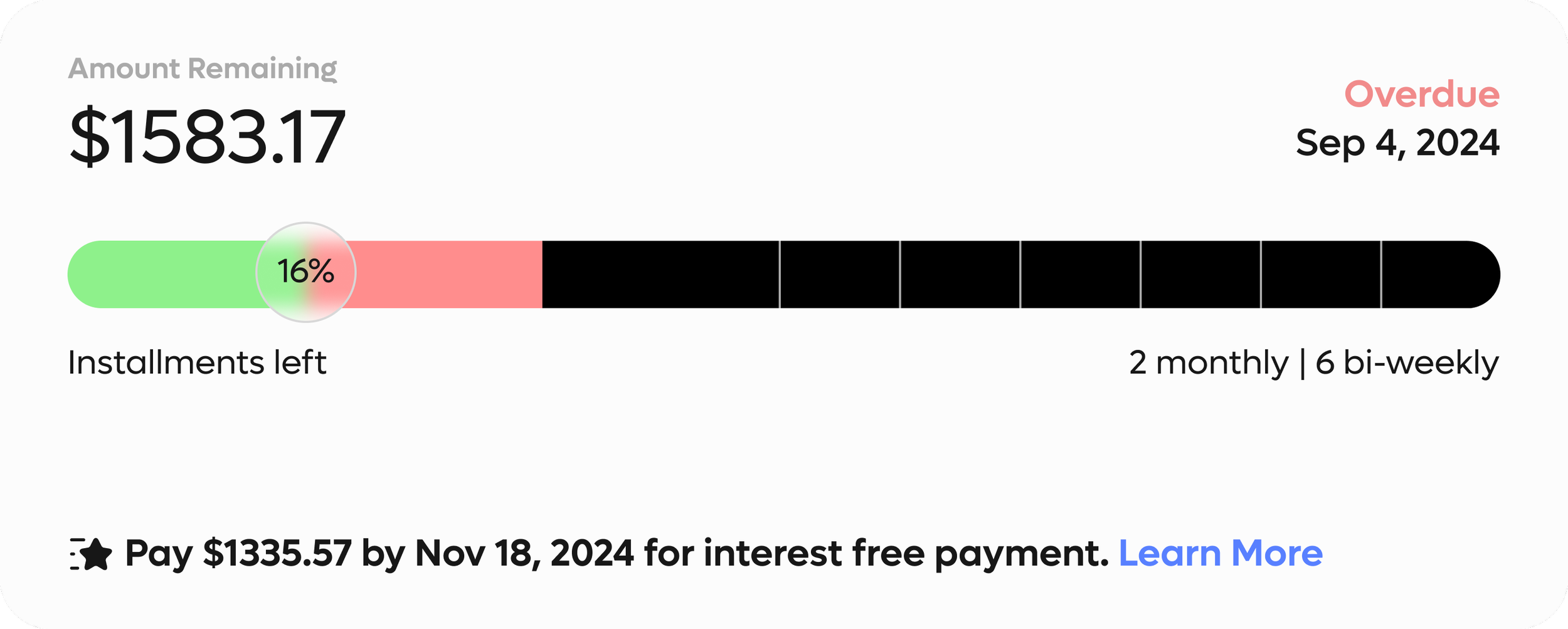
Product Payment Schedule
Product specific schedule visualizing installment progress with color codes. Panel for plan and payment details displaying payment terms, fees, and due dates alongside the schedule for clear, transparent reference.
Next Steps
Metrics
How to measure success of this product?
To gauge the success of the Comprehensive Payment Tracking Suite, I would like to track measure these 3 metrics:
On-Time Payment Rate: Percentage of payments made on or before the due date
User Engagement: Combination of adoption rate and feature usage
User Retention Rate: Increase in customer retention compared to pre-implementation
Takeaways
Designing for fintech means getting comfortable with complexity.
When I first started this project, I was overwhelmed by how many moving parts there were—payment schedules, contract terms, credit impact, and more. I kept second-guessing myself and trying to over-explain every feature. But I eventually realized that in fintech, clarity doesn’t mean showing everything, it means showing the right things. I learned to focus on what users actually needed in the moment, and that helped me simplify the experience without losing important context.
Real users > perfect ideas.
I had a lot of initial ideas about how to fix payment tracking, but once I started digging into reviews and forums, I realized the real pain points were different than I expected—things like trust, confusion, and emotional stress. This project reminded me that designing for fintech isn’t just about numbers and UI; it’s about understanding the emotional weight behind financial decisions. Talking to users and listening to their frustrations grounded the project in reality, and ultimately made the dashboard way more effective.