
Brighttrip
Improving website navigation through heuristics and usability evaluation.
Duration
3 weeks
Type
Individual work
(HCI Fundamentals course)
My Role
UX Designer
User Researcher
Tools
Figma, G-Suite, UserZoom, ANDI, WAVE, JAWS

Overview
Problem
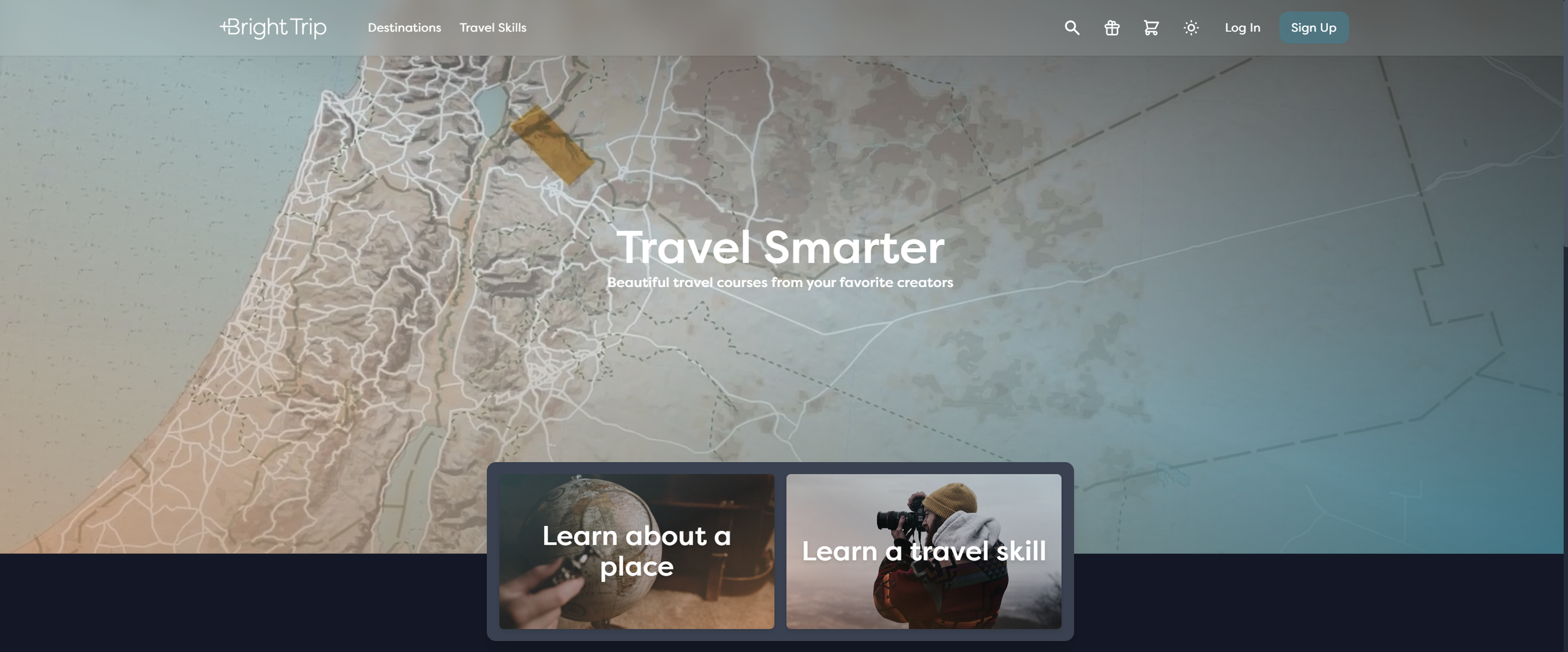
BrightTrip.com offers unique courses to enhance travel experiences. Despite the compelling content and the talented storytellers behind it, the website's catalogue and design leaves users uncertain if they've seen all the content. This frustration could lead to high abandonment rates, potentially compromising the product's success.
Outcome
I conducted a comprehensive evaluation of BrightTrip.com, including a heuristic evaluation, usability study with task analysis, and WCAG compliance test. My goal was to identify key areas for improvement and provide actionable design recommendations to increase task completion rates and reduce task time.
Study
Summary
Approach
I analyzed the website against Nielsen's 10 usability heuristics to identify potential UX issues.
Heuristic
Evaluation
I observed 5 participants using think aloud protocol as they completed key tasks on the website, noting their behaviors and pain points.
Usability Study w/ Task analysis
I assessed the website's accessibility using (WCAG) 2.1 criteria with ANDI and WAVE browser plugins.
WCAG 2.1 Compliance
Key Findings
Content discovery is challenging - Users struggled to understand if they'd explored all available courses, leading to a sense of FOMO (fear of missing out).
"I felt like I was going in circles, never sure if I'd seen everything or how to get back to where I started."
Navigation feels disjointed - The website's structure doesn't provide a clear path for users to follow, causing confusion and disorientation.
Valuable content gets overshadowed - Despite the high-quality courses, users find it difficult to appreciate the full value due to the confusing layout.
"I love Johnny's YouTube content, but on BrightTrip, I'm never sure if I've seen everything. It's frustrating because I know there's probably great stuff I'm missing."

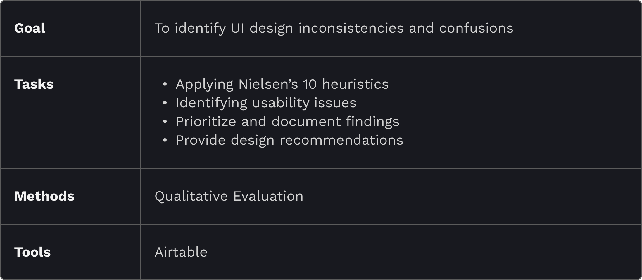
01. Heuristic Evaluation
Identify UI design inconsistencies and confusions by applying Nielsen’s 10 heuristics
Study
Design
Approach
Heuristics Log
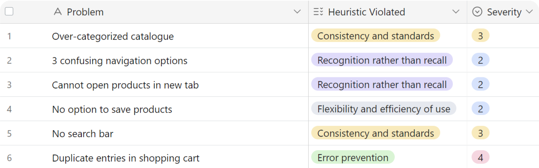
01
Heuristics - Consistency and Standards
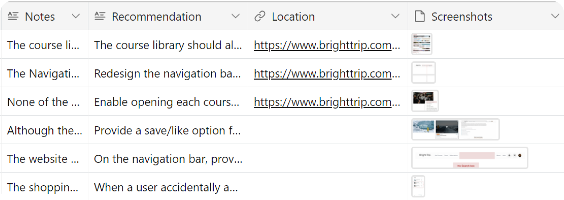
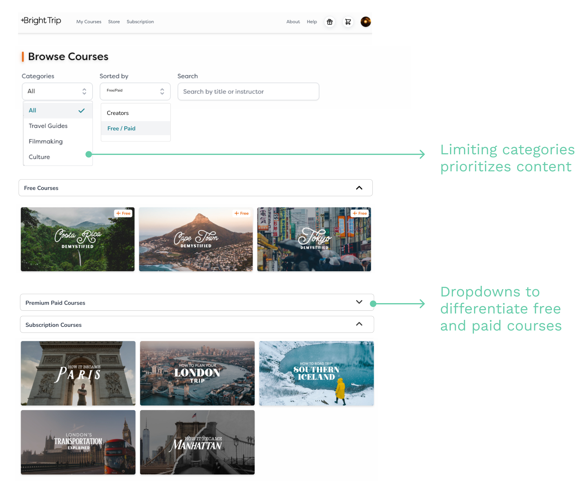
The course library page categorizes courses excessively, resulting in visual clutter.
Issue: Over categorization
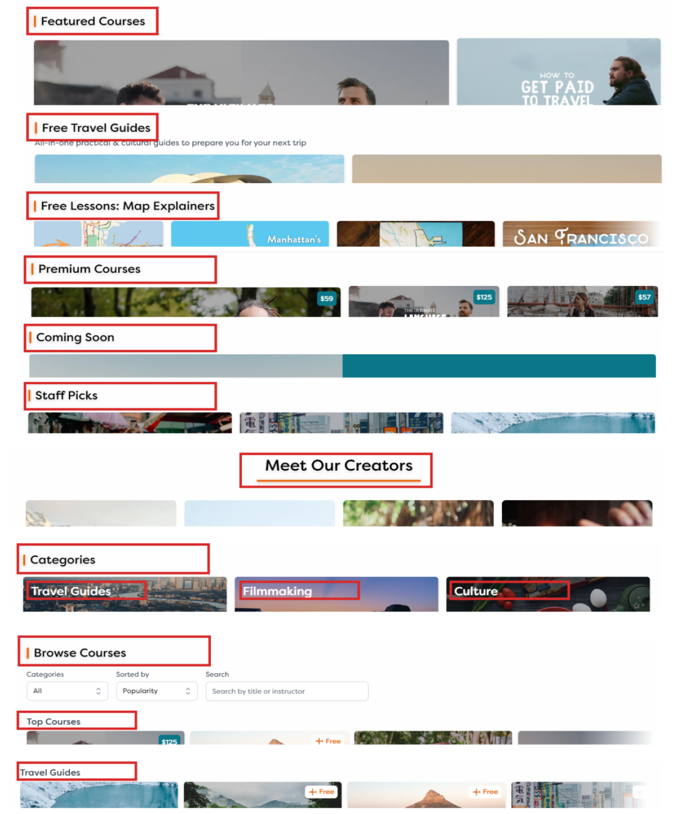
Suggestion: Simplify categories; add filters
02
Heuristics - Recognition rather than recall
The navigation bar neither offers a clear image of the website's information architecture nor correlates to the many categories provided on the library.
Issue: Confusing Nav bar options
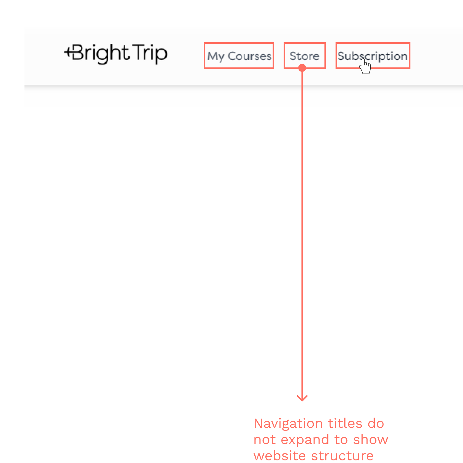
Suggestion: Expand Nav bar links
03
Heuristics - Error Prevention
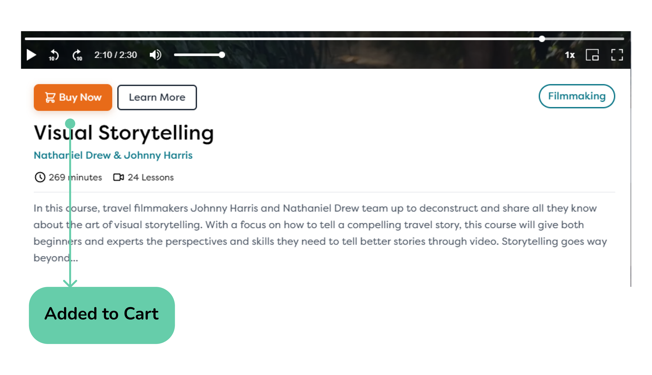
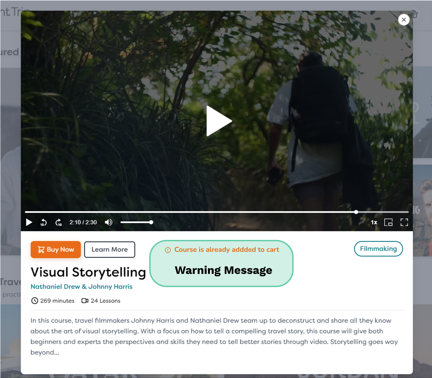
The shopping cart allows users to add the same course twice, potentially resulting in double payment.
Issue: Duplicate entries in Cart
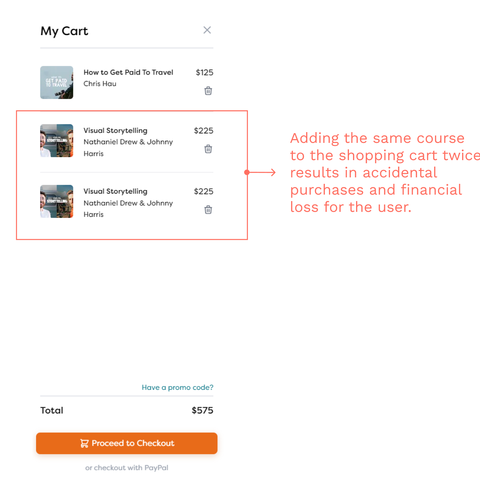
Suggestion: ‘Add to cart’ notification & warning
02. Usability Testing
Identify user problems in navigation through task analysis and provide design solutions
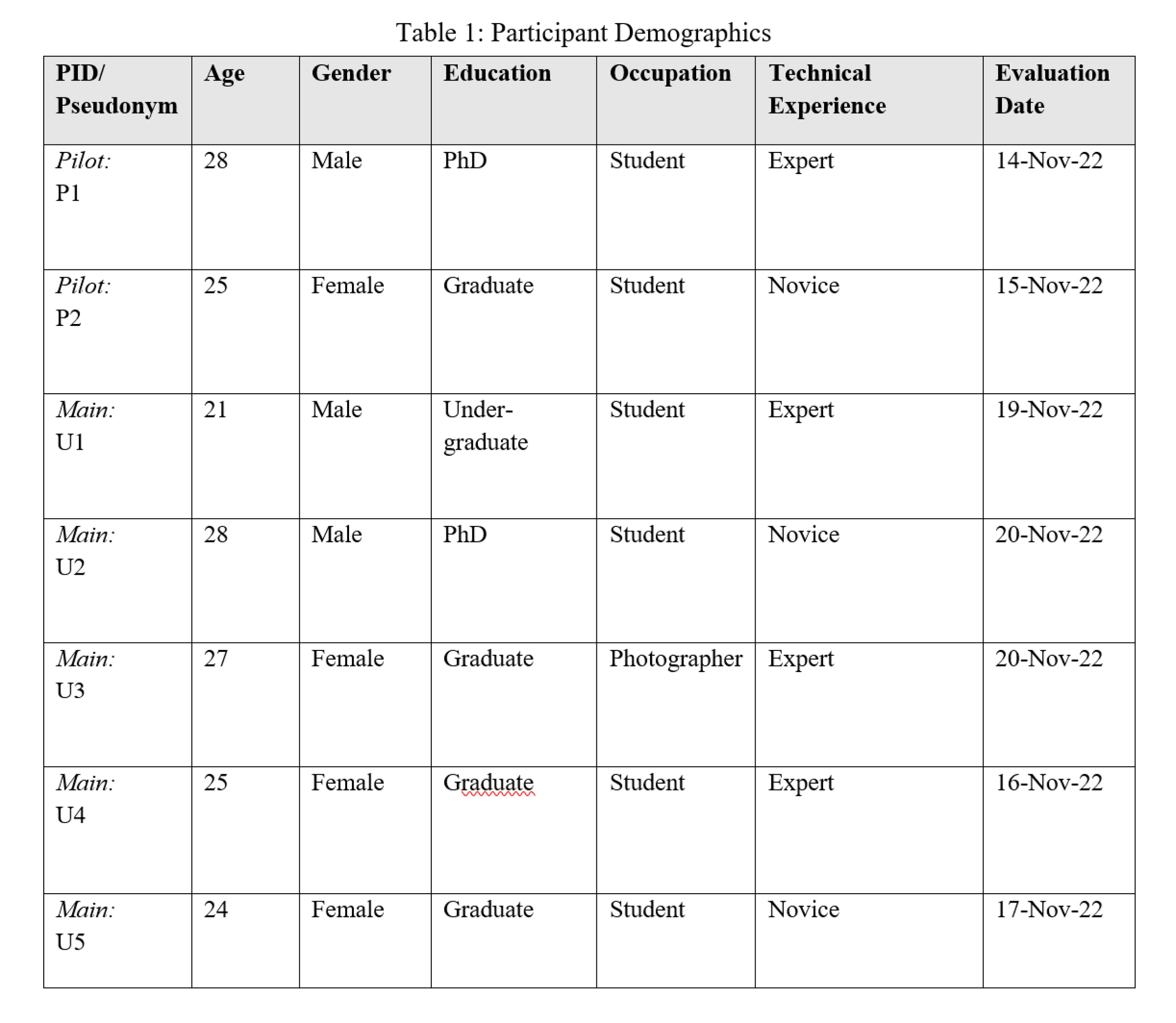
5
Participants
10
Tasks
46%
Avg. Task completion rate
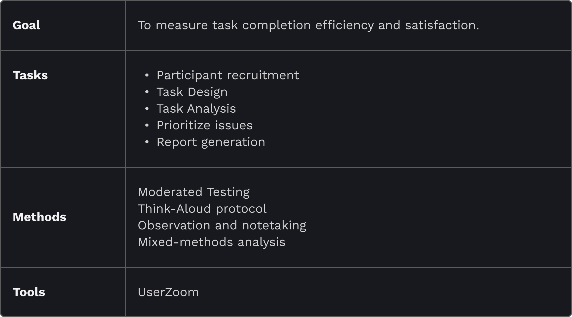
Test Design
Participant recruitment
To ensure relevant insights for our usability study, I selected 8 participants who meet any of the following criteria:
Actively travel and create visual content (e.g., photos, videos)
Regularly watch instructional videos to enhance their skills
Task Design
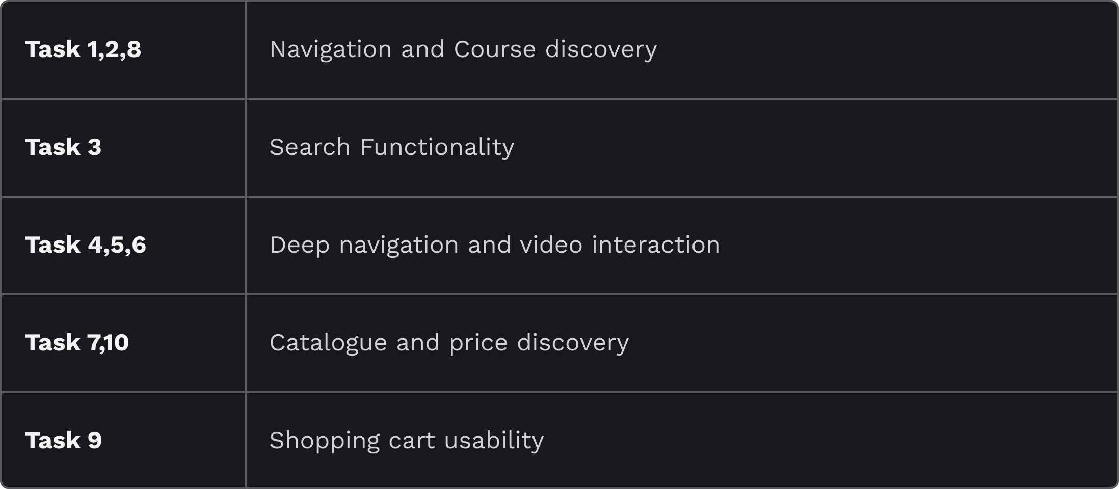
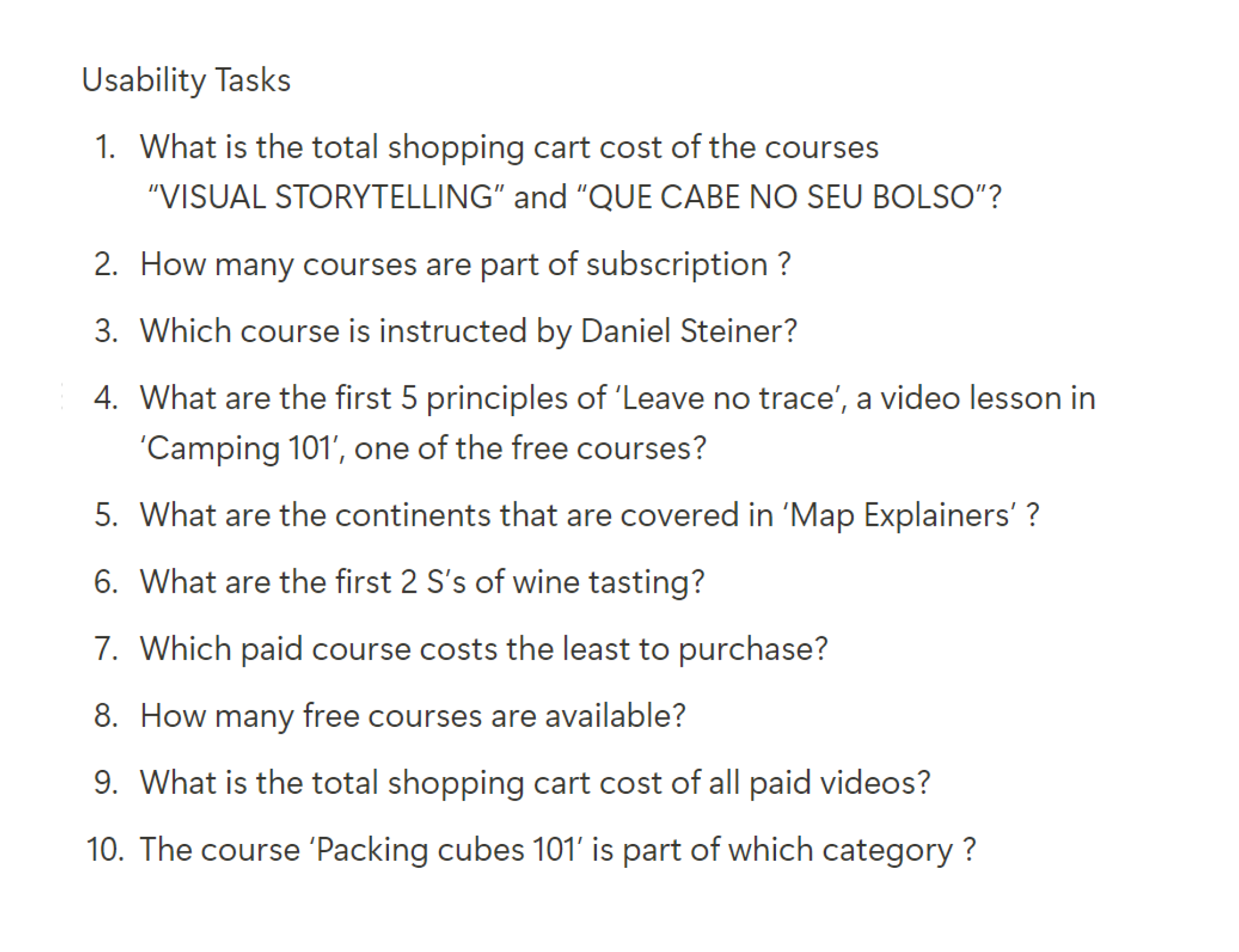
The study included 10 tasks focusing on:
Website navigation - Search functionality - Course interaction
Task Analysis
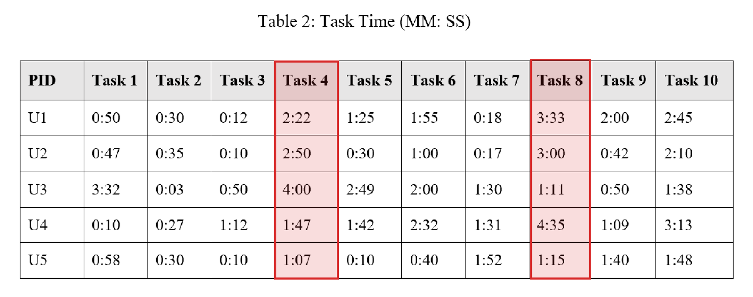
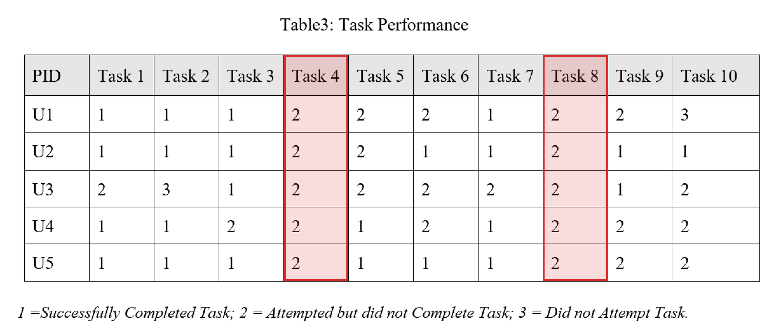
Task 4: What are the first 5 principles of ‘Leave no trace’, a video lesson in ‘Camping 101’, one of the free courses?
Task 8: How many free courses are available?
Task Completion rate: 0%
Users struggled to effectively filter courses as ‘Paid’ or ‘Free’
Results
"The website is annoying; it is tough to find what I want. Even though I see the links, I'm not sure whether they are the whole list because the catalogue page provides additional alternatives. I'm just confused.
Task completion times varied widely, from as quick as 10 seconds to as long as 4 minutes 35 seconds. Users encountered several challenges:
Difficulty locating specific courses, especially when they weren't featured on the main catalogue page
Confusion between 'Subscription' and 'Store' links
Trouble finding and using the search bar
Challenges in navigating course details and video lessons
Including the observations from Heuristic evaluation, 3 more usability challenges were discovered from usability testing:
01
Problem
Confusing words ‘Store’ and ‘Subscription’
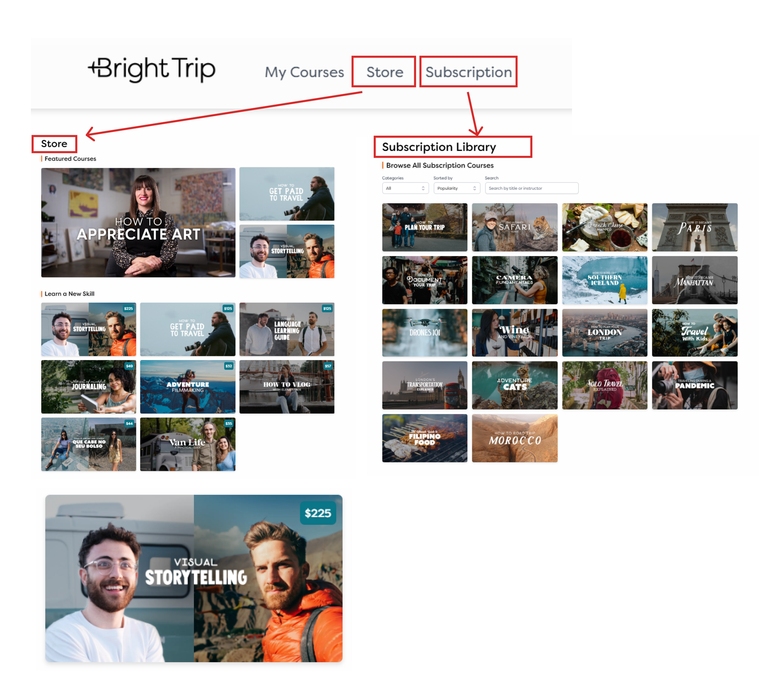
Solution
New Categorization- ‘Courses’ & ‘Creators’
02
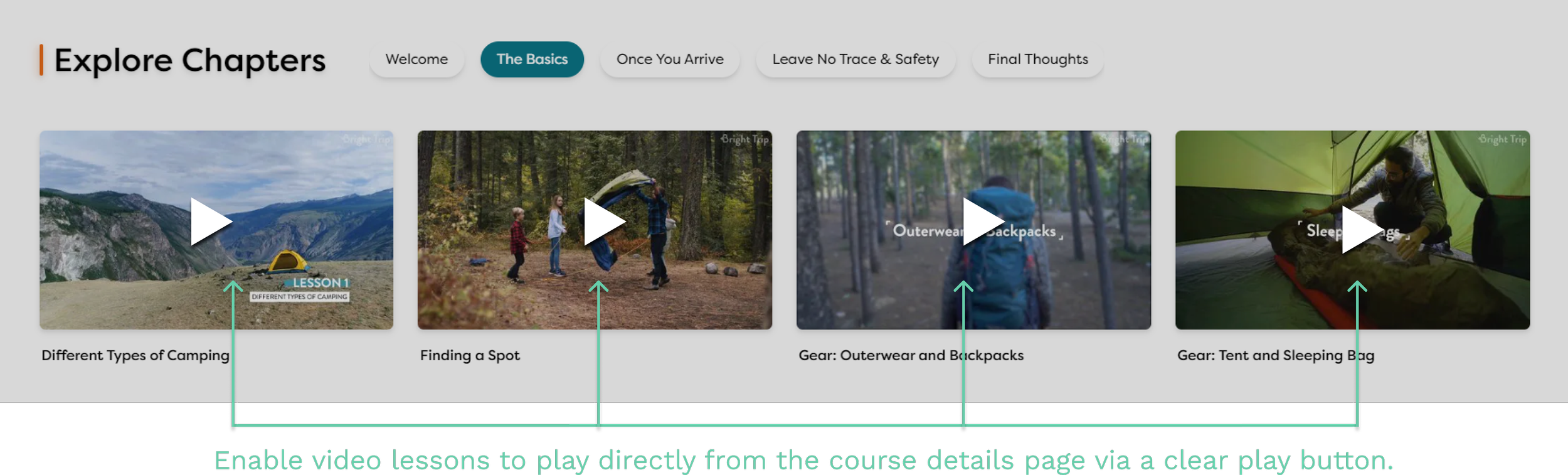
Problem
The thumbnails for ‘Explore chapters’ are not usable
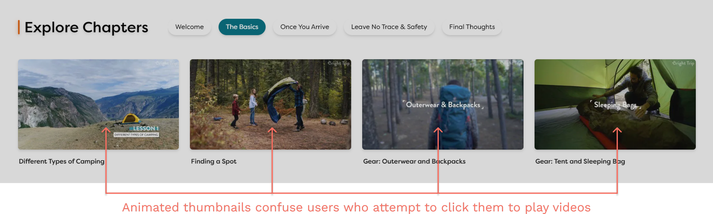
Solution
Implement Play buttons on thumbnails
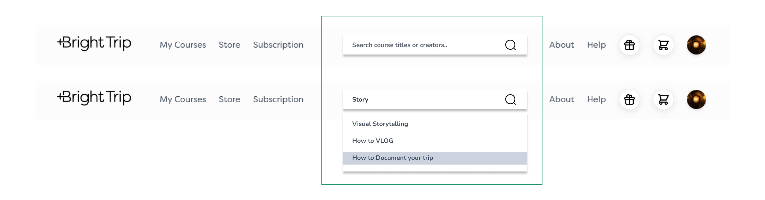
03
Problem
Users expressed frustration when trying to find the search bar. They expected it to be at the top of the page, as is common on most websites. Instead, it was hidden in the 'Browse Courses' section, which didn't even display all available courses.


Solution
Move search bar to the top of the page.
Reflection
Next Steps
Small changes can make big impacts
I was surprised to see how seemingly minor issues, like the search bar placement, significantly affected user behavior. It reminded me that in UX design, details matter tremendously. Sometimes, simple adjustments can dramatically improve usability without requiring a complete redesign.
Combine methods for deeper insights
Conducting both heuristic evaluation and usability testing revealed a fuller picture of the user experience. While the heuristic review caught many issues, usability testing uncovered nuanced problems I hadn't anticipated. This combination helped me see beyond my own biases and assumptions.
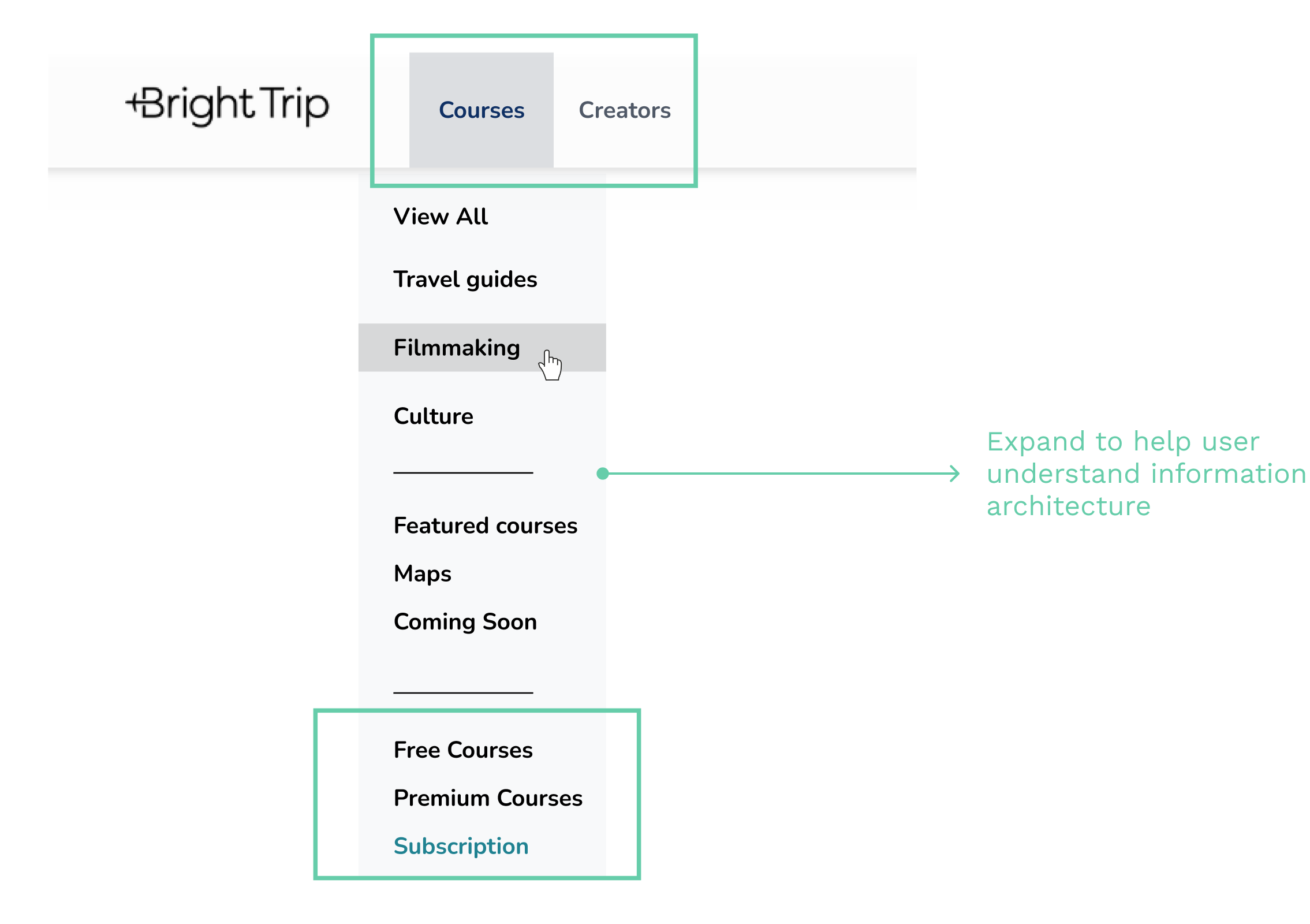
Communication and new website
After compiling my findings from the heuristic evaluation, usability study, and WCAG compliance test into a detailed report, I shared it with Johnny Harris, the product owner of BrightTrip. To my surprise, the website underwent a redesign shortly after.
While browsing the new site, I noticed that some of my suggested solutions had been implemented. However, I also observed that several key issues I had identified remained unaddressed.
New Categories - Destination & Skills

“In cart” notification
Additional Links
You can find the detailed reports of the above website evaluation here
NEXT