
DC Airports APP
Redesign for quicker information retrieval
Duration
4 weeks
Type
School Project
Scope
UX/UI Design
User Research
Tools
Figma, Real eye,
Notion
Overview
Problem
During a recent trip, the cluttered and unreliable DC airport app frustrated me, lacking quick access to crucial details, especially under airport stress. Realizing others might face similar issues and recognizing the app’s potential, I seized the opportunity to redesign it in my coursework for better usability through information reorganization.
Outcome
I redesigned the primary functions of the app that allows users to quickly retrieve information so they can plan their travel better.

01. User Research
How do users interact with an airports app under high-stress?
Audience
International Students
Initially, the app targeted frequent flyers, business travelers, and leisure travelers. However, with a tight 4-week timeline to redesign 5 screens, I identified international students as the optimal audience.
Passenger

Special Assistance

Pickup/Drop
Survey
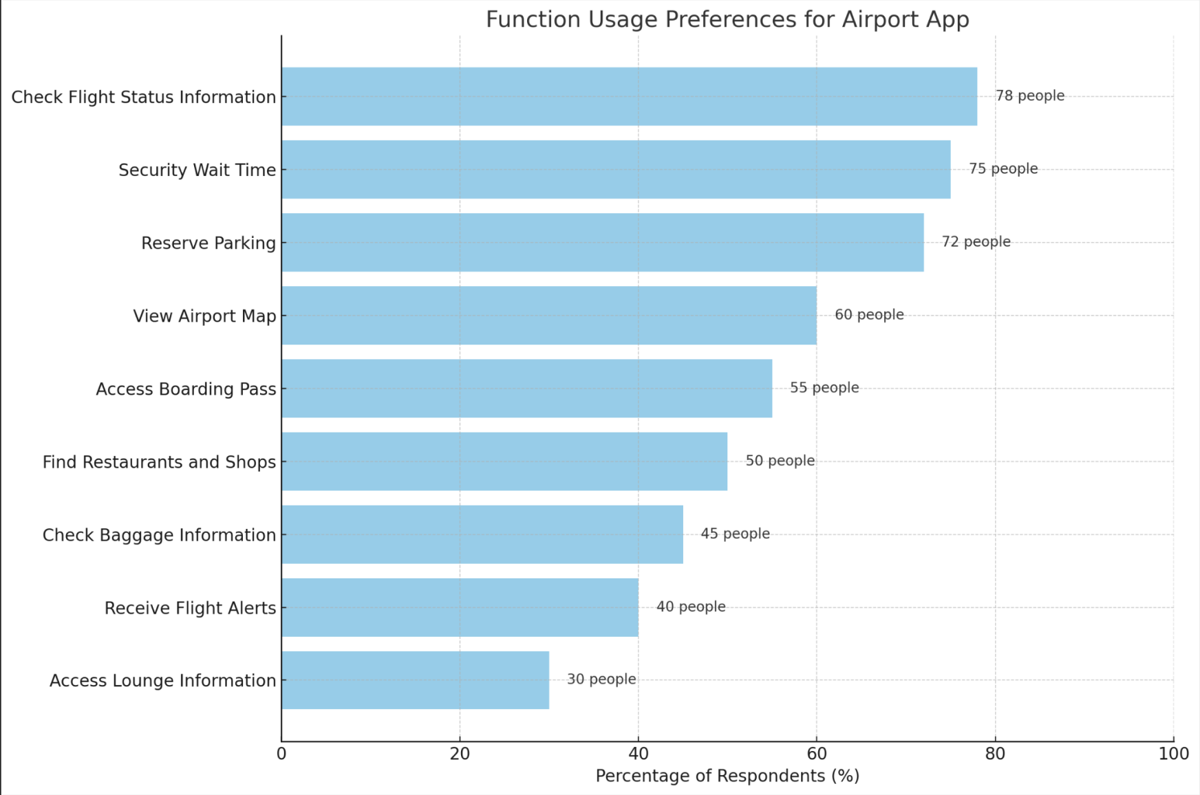
Most valuable features
Majority prioritized checking flight status (78%), security wait times (75%), and reserving parking (72%). This feedback was helpful in setting the focus areas for the app’s redesign.
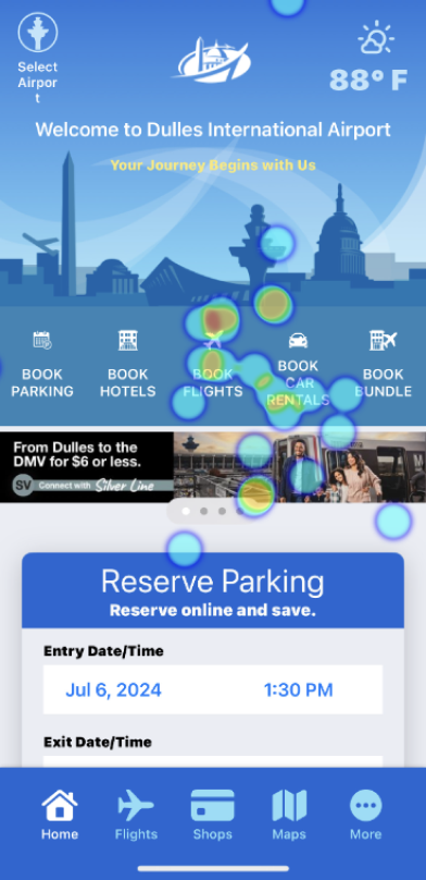
Eye Tracking
Home screen interaction
To further refine the app, I employed eye-tracking technology with 5 participants. Based on survey results, the participants were given 3 tasks:
Find current status of a specific flight
Find security wait time at 4:00PM
Identify nearest parking options
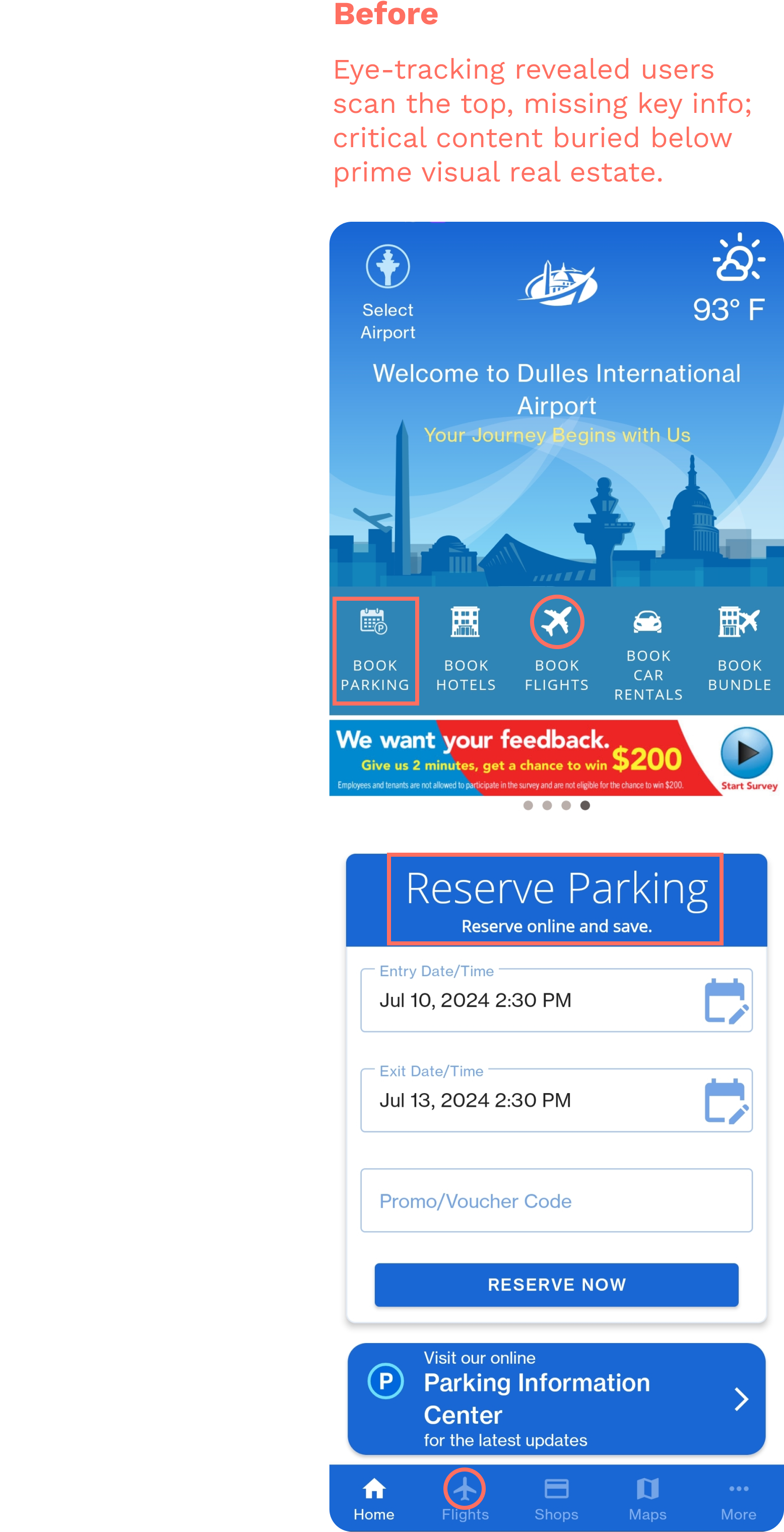
While parking was found in 5s, the other tasks took over 20s, including tasks that were not completed. This prompted a necessary redesign of information hierarchy and content optimization of the home screen layout.
Cognitive Load
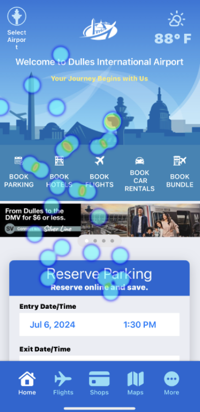
Heat maps revealed excessive time spent scanning the interface, indicating high cognitive load and frustration leading to giving up on completing tasks.
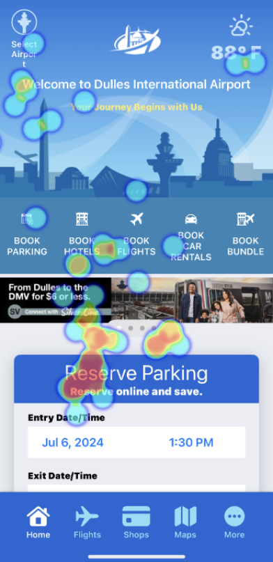
Navigation Patterns
User gaze patterns revealed users focused on the top half, filled with illustrations but no interactive elements. This misalignment between visual focus and functionality suggests a need to reconsider content placement.
Analysis
User Pain points
From analyzing the Survey and Eye Tracking results, I wanted to uncover how people interact with the airports app, and their struggles that contribute to the problem. Here are the key user pain points:
Difficulty in quickly finding desired information
Users often confuse the "Book Flights" button on the home screen with the "Flight" icon on the navigation bar. This leads to trial and error causing user frustration in app navigation.
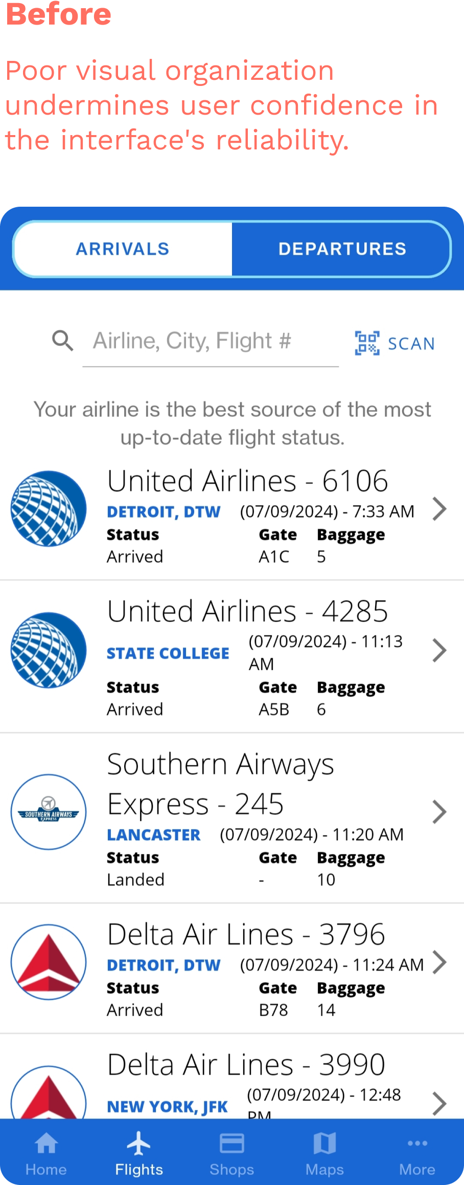
Disorganized layout undermines user trust in information accuracy
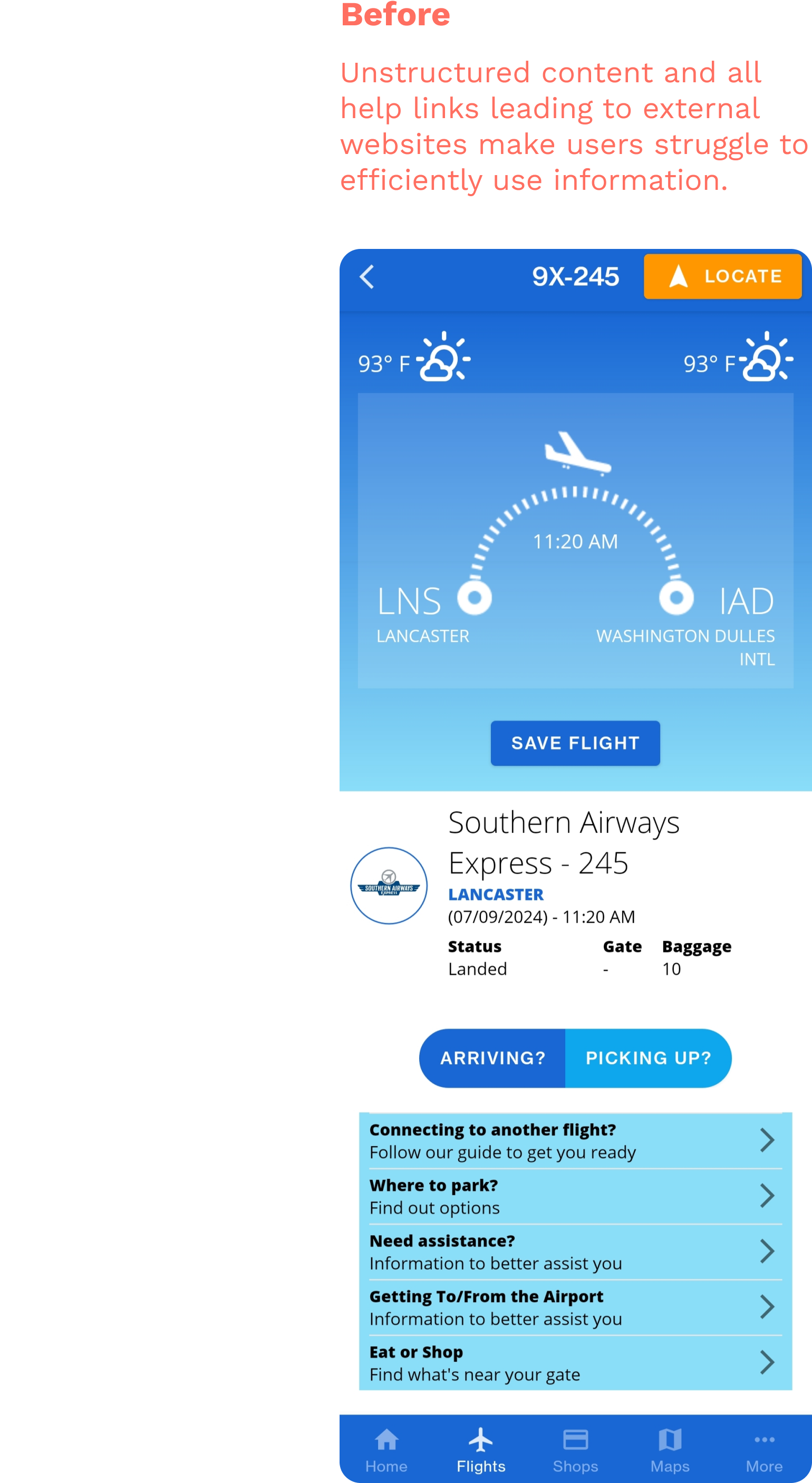
The cluttered presentation of flight lists and full flight details lacks logical hierarchy and visual appeal. This disorganization leads users to question the authenticity and reliability of the information provided.
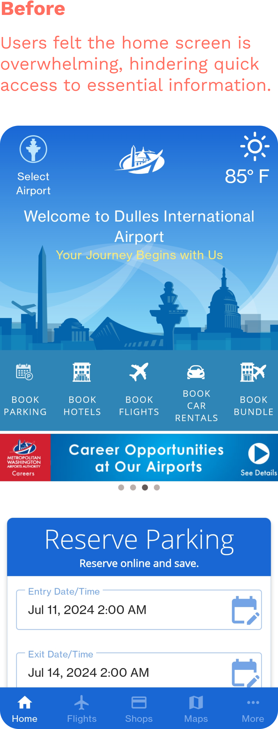
Overcrowded home screen hinders navigation and readability
The home screen features several low-contrast labels and 14 functions, overwhelming users. This clutter causes readability issues and forces users to scan the entire app, complicating navigation and information retrieval.

02. Design Solutions
How might we redesign to help users quickly find, read, and trust the presented information ?
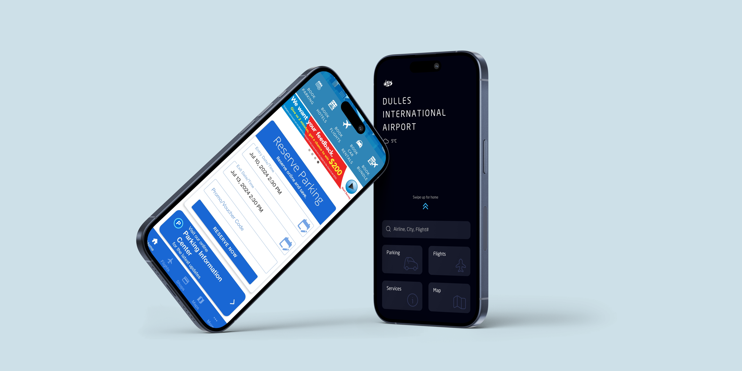
01 Pre-Home Quick Access
Designed from survey results, to provide users with immediate access to crucial functions—flight info, parking, maps, and services— without navigating the entire app.
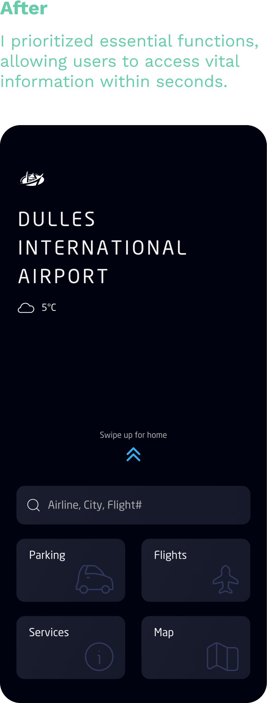
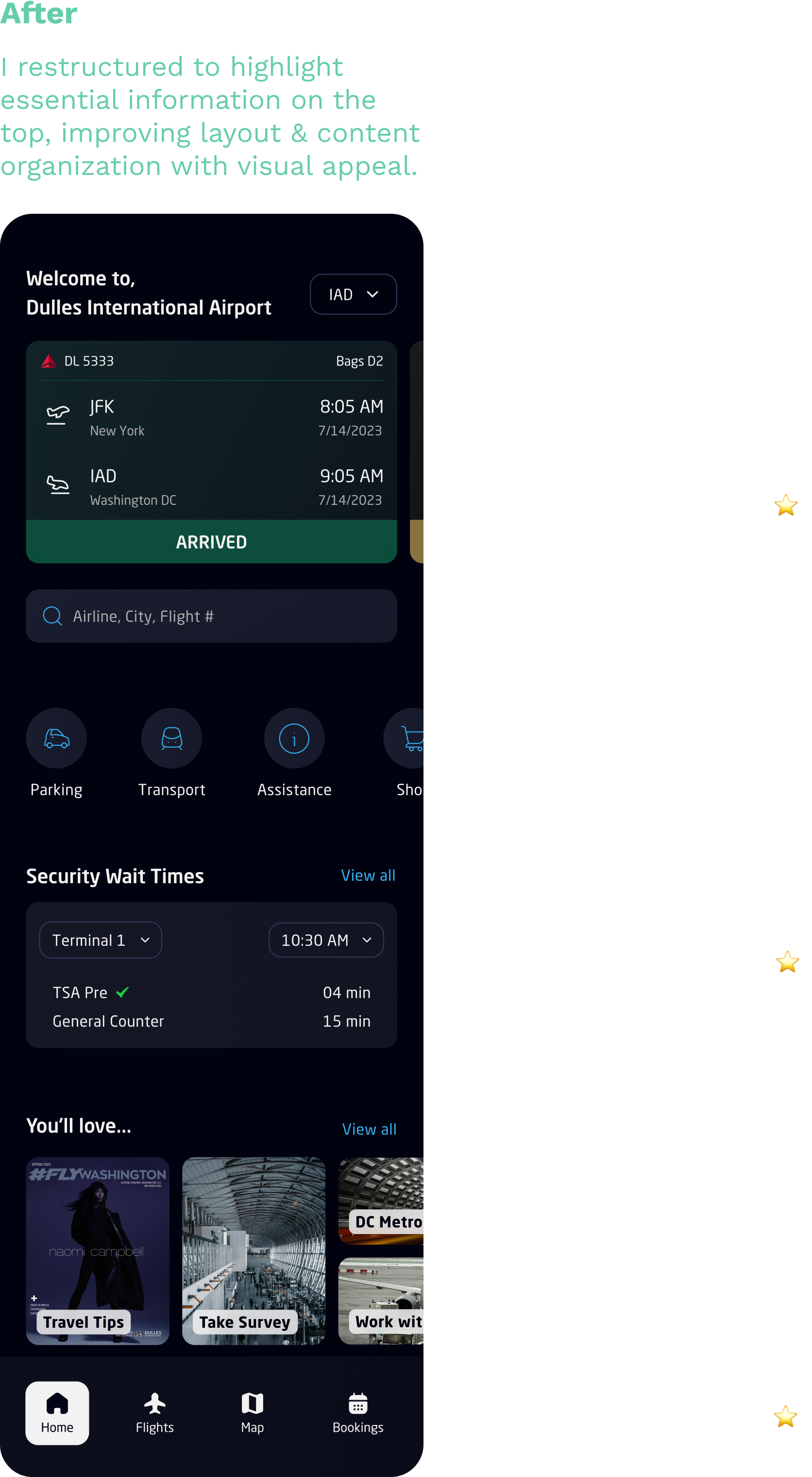
02 Home Screen
A revamped home screen that focuses on presenting essential information clearly while maintaining access to all original functions.
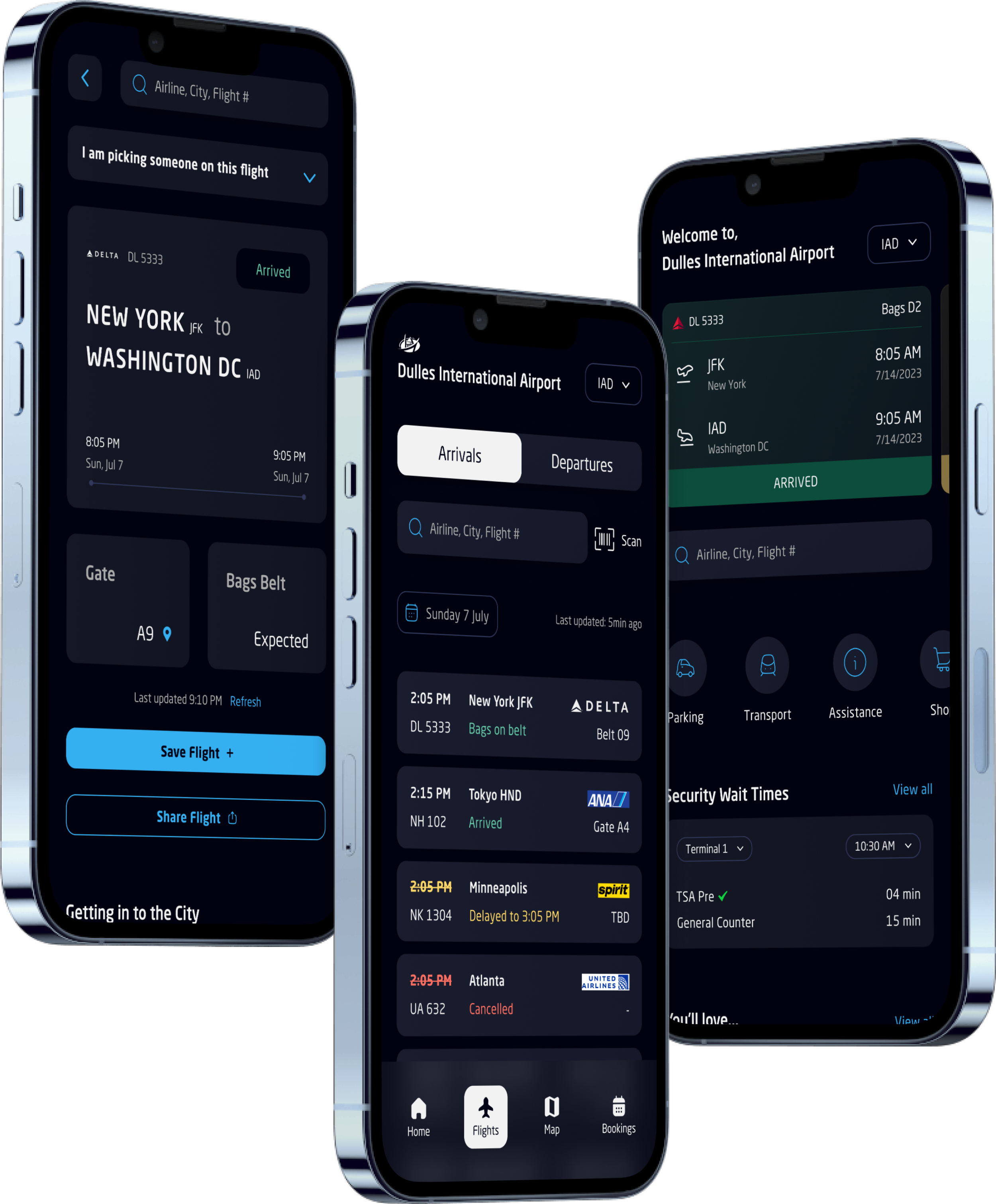
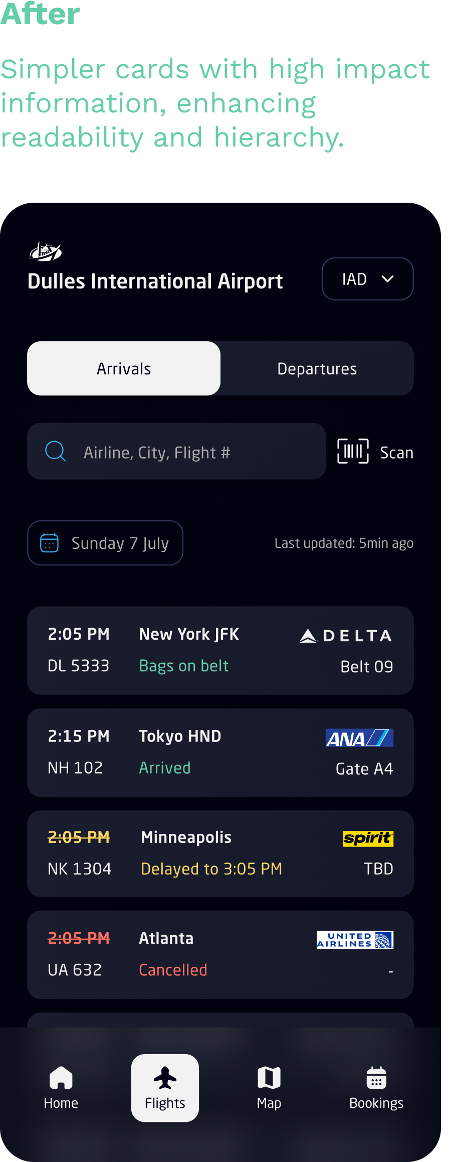
03 Streamlined Flight Information
Provides a comprehensive list of all airlines' arrival and departure flights at IAD. The restructured flight info cards offer improved readability and easier searchability.
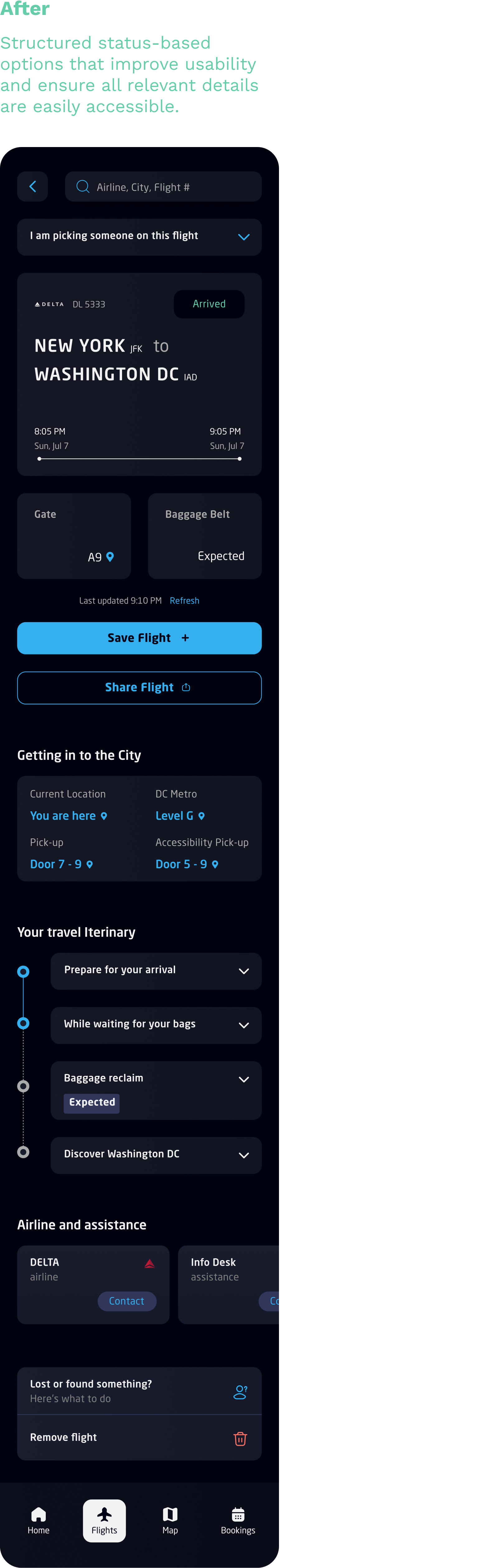
04 Full Flight Status & Tracking
A full flight and airport info screen that assists travelers and non-travelers by providing options based on current flight status with a clear visual hierarchy.

03. Design System
Design
Inspiration
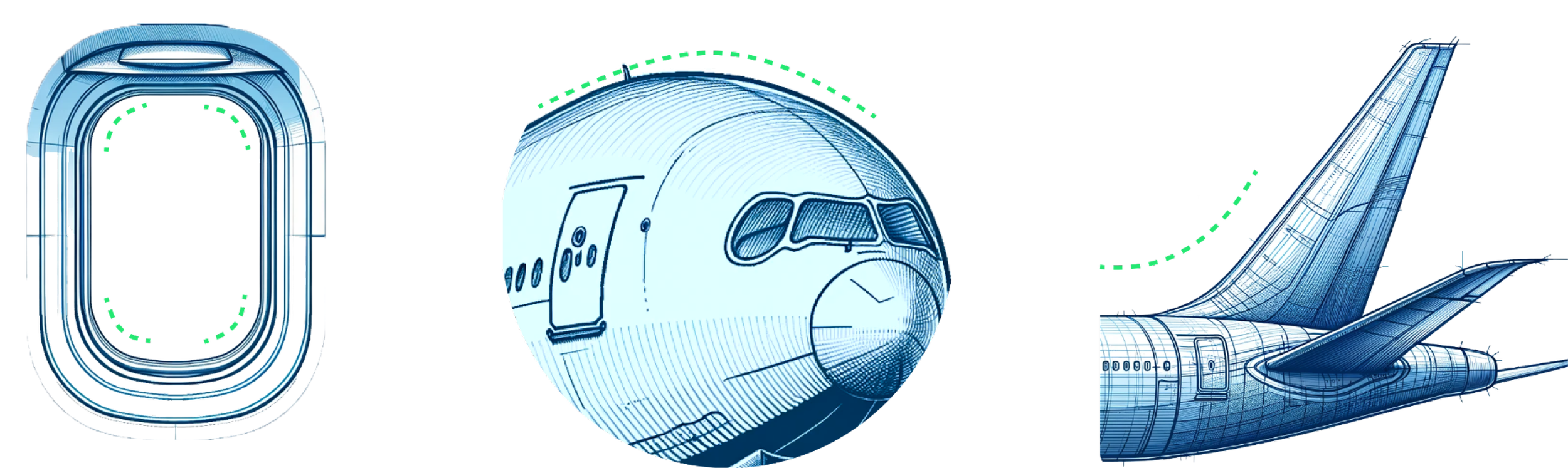
Aerodynamic curves
I drew inspiration from airplane aerodynamics. The UI design incorporates sleek curves, mirroring aircraft contours to create an intuitive, visually appealing interface.
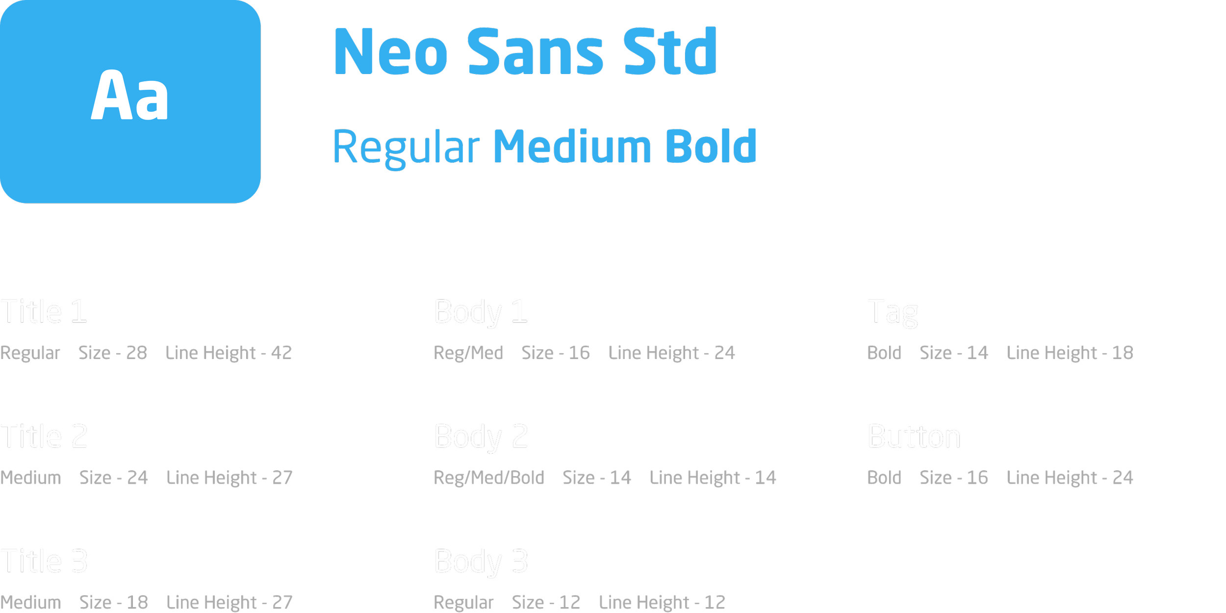
Typography
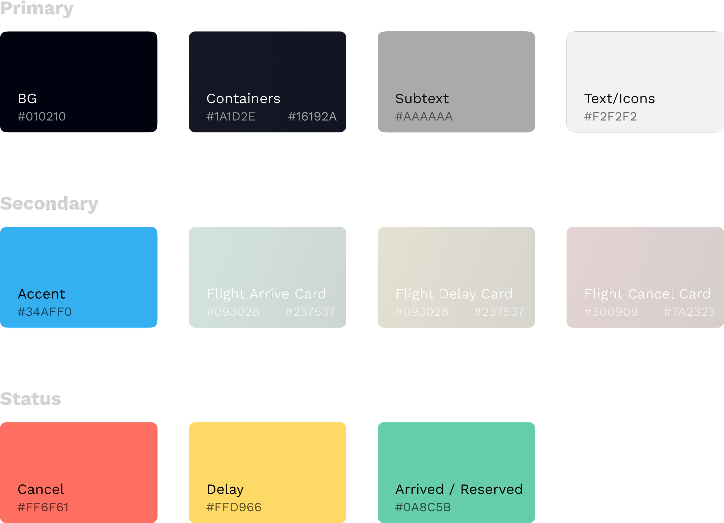
Colors
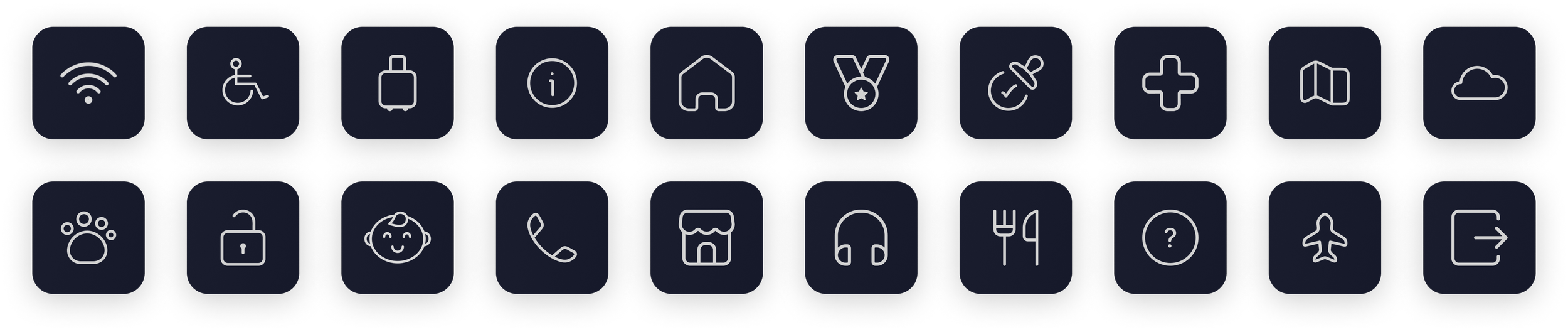
Icons
Takeaways
Design decisions under pressure
In the face of tight deadlines, I learned to trust my design instincts and make swift decisions. Rather than getting caught in endless iterations, I prioritized progress over perfection. This experience taught me that confident decision-making, even with imperfect information, is crucial in real-world design scenarios.
Resisting the Aesthetic Temptation
I started this project with one goal in mind, to make the experience of finding flight information quicker and more efficient. However, I often got sidetracked trying to perfect the visual design. I realized that chasing aesthetic perfection at the expense of core user needs was counterproductive. In real-world projects, constraints require prioritizing what truly matters. This experience taught me to stay focused on user insights, resisting the urge to compromise functionality for visual appeal.
Testimonial
Professor’s Praise
“Feels very nice and modern on first glance. Friendly and super readable. I am trying to think if I would ever download an airport app and I would say no but this has me questioning myself ;)”
— Jason Aston
NEXT